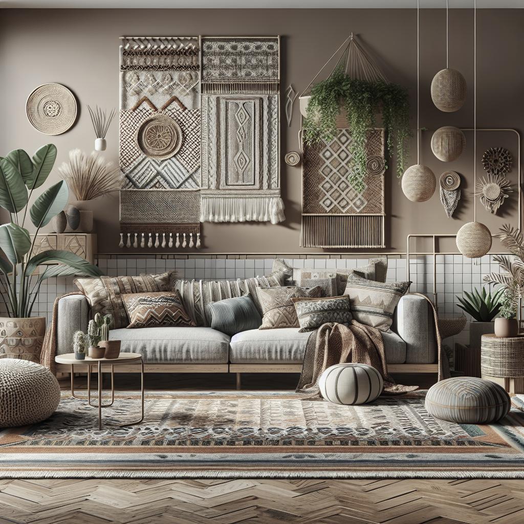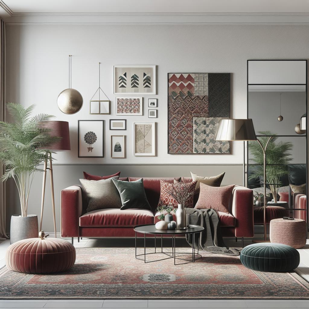
## Mixing patterns and prints in interior design In the realm of interior design, blending patterns and solids can invigorate a space, adding texture, depth, and personality. The mix can create visual intrigue, highlight focal points, and alter perceptions of space size and function. However, achieving harmony without overwhelming a room can be tricky. This guide delves into how to masterfully balance patterns and solids, offering insights from choosing a primary fabric to layering slowly for the perfect blend. Whether you’re redecorating a living room or modifying a bedroom or hallway, these principles will help infuse your home with style and charm while maintaining an elegant balance. ## 1. First rule: there are no rules Interior decoration thrives on personal expression, and the first rule to remember is that there are no fixed rules. Your space should reflect your personality, quirks, and tastes. While guidelines can facilitate the creative process in mixing patterns, the ultimate judge of harmony in your design is you. Trust your instincts and personal style when decorating. Experimentation is key. Sometimes conventional wisdom might suggest specific combinations, but don’t shy away from pairing unconventional patterns. The eclectic blend could lead to surprisingly pleasant results. Go ahead and mix stripes with florals or geometric prints with animal patterns to find what resonates with you. ## 2. Give patterns space to breathe While mixing patterns can add vibrancy to a room, it’s important to leave breathing space. Overcrowding a room with too many prints can create chaos leading to a visually overwhelming environment. To achieve visual balance, intersperse patterns with solid colors that provide calm within the storm of prints. Solids act as essential intervals that define each pattern, allowing their individual beauty to shine. For instance, if you’re using patterned cushions or a printed wallpaper, let surrounding elements like curtains or upholstery in solid colors act as a quiet backdrop. ## 3. Start your scheme with a rug A rug often sets the foundation in a room. Selecting a statement rug can establish the color palette and style direction for the rest of your design. Rugs are versatile and can anchor your patterns while harmoniously connecting all components within a room around them. Choose a rug that speaks to the desired mood of your space. Whether it’s an intricate oriental pattern or a bold geometric design, use the rug as a guiding star for the mix of patterns and solids. This piece will ground your design and influence other choices, from furniture fabrics to accessory prints. ## 4. Create balance with pattern Achieving balance with patterns often involves understanding the roles each pattern plays within a room. Balance is not about equality; it is about distributing visual weight according to the room’s needs and function. Patterns can serve as features or background elements, depending on what the room requires. Using visual tricks like asymmetric patterns can balance a room by leading the eye along a particular path. The key is to start sparingly, incorporating patterns systematically. This method tends to maintain a cohesive look where nothing distracts from the overall aesthetic appeal. ## 5. Start with the showstopper fabric Identify a standout fabric to be your showstopper. This could be an eye-catching sofa fabric, a feature wallpaper, or a luxurious curtain. The showstopper fabric incorporates your desired color and pattern theme, setting the tone for everything around it. Let this fabric command attention and guide subsequent selections. It’s the piece that all other elements in the room will echo or contrast with, ensuring a harmonious atmosphere. ## 6. Find other fabrics to mix with your showstopper fabric Once your central pattern is established, it’s time to introduce complementary fabrics. Look for patterns that share elements or colors with your showstopper but bring a variety of textures and styles. Consider tonal variations or different motifs that resonate with the main fabric without competing for attention. Conduct side-by-side comparisons to test compatibility. Ensure secondary fabrics support the star of the room, allowing for a visual dialogue where no element feels out of place. ## 7. Keep the color palette simple When working with multiple patterns, a simplified color palette prevents visual overload. Choose a core set of three to five colors that can repeat throughout the room. These recurring hues become the link across various patterns, providing a sense of unity. Simple color schemes also offer flexibility in pairing patterns, helping to avoid clashing and disharmony. A consistent palette of colors across patterns can introduce variety effortlessly while maintaining order. ## 8. Take pattern scale into account Patterns come at various scales, and considering their size is crucial when pairing them within a room. Combining different scales of print—from large, dramatic patterns to small, subtle ones—ensures the space doesn’t feel one-dimensional. For instance, balance a bold floral with a subtle pinstripe to vary visual interest. Avoid using only large or small patterns, as equilibrium in scale results in a more finished and sophisticated look. ## 9. Narrow down your pattern choices With countless patterns to choose from, your challenge is narrowing down your options. Select patterns that reflect the room’s purpose and mood. For instance, angular geometric patterns may suit a modern office, while soft florals might fit well in a cozy bedroom. Test different patterns together in small swatches to ensure they work together before committing to larger purchases. Trust your gut feeling on what suits your visual taste and the room’s function. ## 10. Layer and mix patterns slowly Patience is essential when integrating patterns; it’s best executed in layers. Begin with a couple of patterns and build upon them gradually. Start with larger expanses, such as walls or floors, before infusing smaller accents like pillows or vases. Incremental layering allows time to assess harmony, adjust unwanted elements, and ensure the room evolves uniquely without sudden clashes. ## 11. Add interest with patterned vintage fabrics Incorporating vintage fabrics can augment interest and character in your design. Vintage textiles often carry a history and uniqueness that modern options might lack. Their distinct patterns can seamlessly blend the old with the new in eclectic décor styles. Embark on a treasure hunt to thrift shops for one-of-a-kind finds, or repurpose vintage curtains, bedspreads, or upholstery as accent pieces. These additions often act as conversation starters, adding layers of story into your space. ## 12. Mix opposites for impact – and balance Daring design choices often involve juxtaposing opposite elements. Mixing contrasting patterns, like pairing classic florals with modern abstracts, can create stunning visual impact when balanced correctly. The collision of different styles may translate into unexpected harmony. Consider balancing warm versus cool patterns or organic shapes against geometric forms. Measure both the appeal and challenge these opposites offer, refining each until a balanced blend emerges. ## Using pattern in a living room Living rooms require patterns that foster relaxation while offering visual stimulation. Large-scale patterns on curtains or rugs can direct the room’s color palette, while smaller patterns on pillows or throws add texture. Use patterns strategically to guide conversation areas or draw attention to architectural features. A balanced composition of patterns can transform a living room into a welcoming and engaging hub of the home. ## Using pattern in a bedroom Bedrooms are havens of rest and should prioritize soothing patterns. Opt for soft fabrics with gentle patterns on bed linens to create a calming atmosphere. Wall patterns can include more robust themes if tempered with solid textures and furnishings. Maintain focus by selecting patterns that enhance tranquility, using them on drapery or accent walls for subtlety. The coupled play of patterns and solids aids in crafting a peaceful sanctuary. ## Using pattern in a hallway Hallways demand boldness yet serve brief interactions. Consider vibrant patterns that energize quick transitions, using stripes or geometrics to elongate or expand perceived space. Pair these with neutral solids to prevent overwhelming tightly-constrained spaces. Artfully incorporated patterns can surprise and delight, making mundane passageways memorable while cohesively connecting other rooms within the broader design scheme. ## Sign up to the Homes & Gardens newsletter. Stay informed on the latest trends and tips in home and garden design by subscribing to our newsletter. Whatever style or scope your project involves, our curated content can inspire creative living spaces and outdoor sanctuaries. ### Final thoughts Mixing patterns and solids in home interiors is both art and science, requiring a balance of creativity and strategy. A thoughtful approach combining bold patterns and calming solids can elevate any room’s aesthetic, enhancing both function and style. As you embark on your interior design journey, remember that the beauty of your home lies in its reflection of you—embrace the freedom to express it boldly and authentically.
| Aspect | Considerations |
|---|---|
| Patterns & Prints | Experiment freely, but keep it cohesive. |
| Space to Breathe | Balance patterns with solids for calm. |
| Starting Point | Anchor with a statement rug or fabric. |
| Balance & Contrast | Play with pattern scale and complementary fabrics. |
| Color Palette | Keep it simple to tie room elements together. |
| Layering | Add patterns gradually for a cohesive look. |