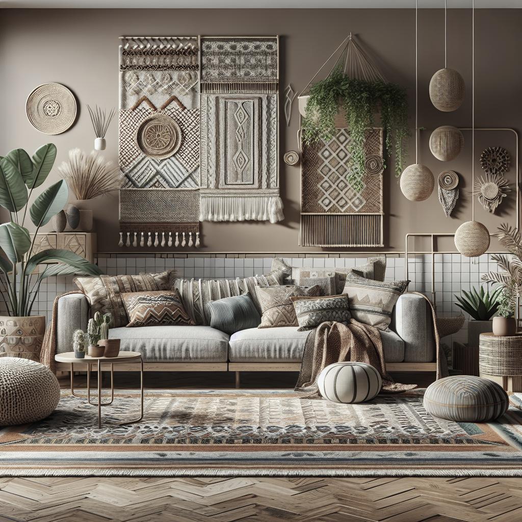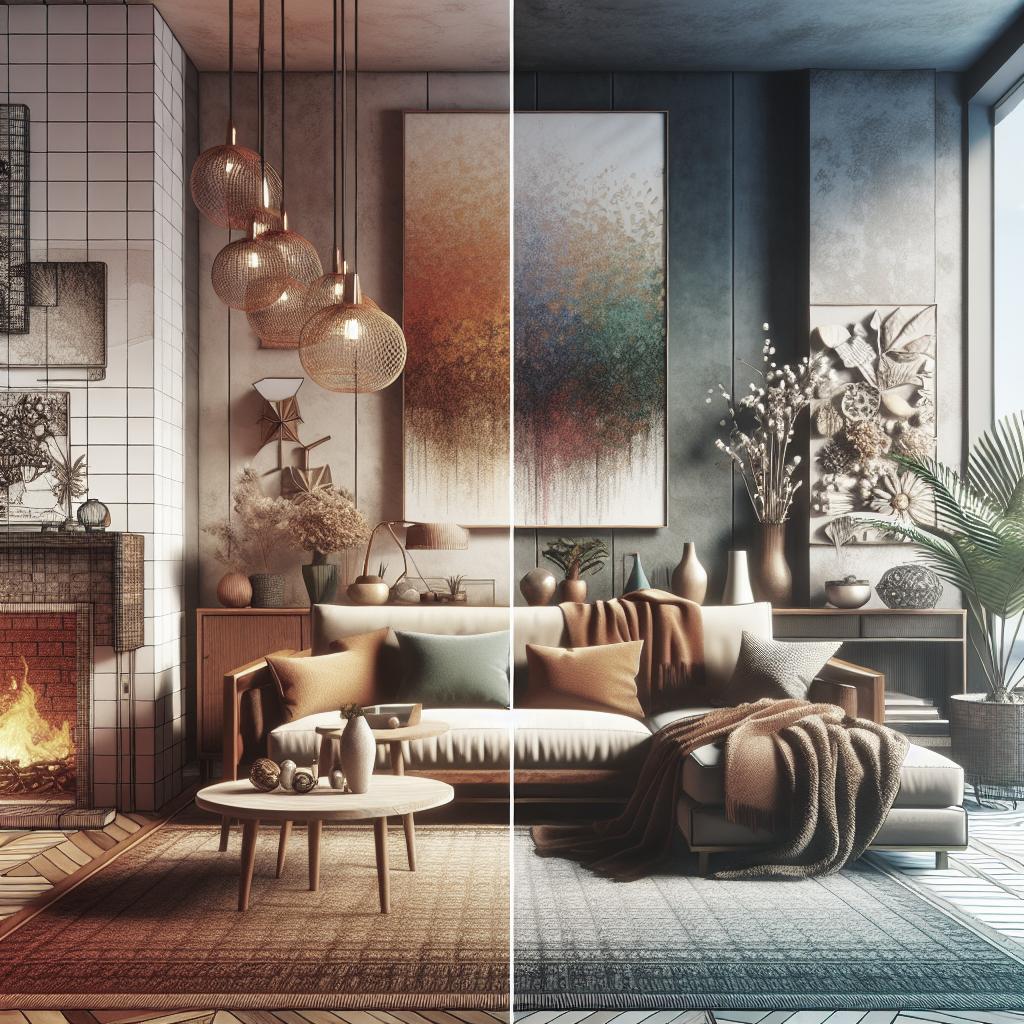
Decorating a space often involves a delicate balance between warm and cool tones. By mastering this balance, you can create a harmonious environment that reflects your personal style and enhances the mood of your home. In this blog post, we’ll explore the essentials of the color wheel, dive into the characteristics of warm and cool colors, and break down the basics of mass tone and undertones. We’ll discuss the role these elements play in interior design and offer guidance on how to mix and match them effectively. Our aim is to empower you with the knowledge to confidently blend these tones, whether you’re choosing paint for your walls or selecting furnishings. Additionally, we’ll provide practical tips and rules to help you identify and apply undertones in your own space. Let’s embark on this colorful journey to enrich your home with balanced and cohesive design strategies. ## LET’S TALK ABOUT THE COLOR WHEEL The color wheel is a foundational tool in understanding the relationships between colors. It includes primary colors (red, blue, yellow), which mix to create secondary colors (green, orange, purple), and further combining these gives us tertiary colors. This circular diagram helps explain how colors interact and can be utilized to create either harmony or contrast in decor. Understanding the positioning of colors on the wheel is crucial. Colors that are side by side, known as analogous colors, tend to blend well and produce a calming effect. In contrast, colors opposite each other, known as complementary colors, create vibrant and dynamic spaces. These basic principles of color relationships set the stage for discussing warm and cool colors in more depth. A meaningful aspect of the color wheel is its role in predicting color temperatures. As you move around the wheel, you’ll notice shifts between warmer and cooler hues. Recognizing these shifts is vital in planning any decor that aims to achieve visually pleasing results. ## WARM COLORS Warm colors are those that are often associated with energy and positivity, such as reds, yellows, and oranges. These colors can make a space feel cozy and inviting, adding vibrancy and life. They tend to advance in space, making elements seem closer and more intimate. Incorporating warm tones into a decor scheme can be as simple as selecting rich textiles or accessories like throw pillows and rugs. However, it is crucial to balance these with cooler elements, especially in rooms that already receive a lot of natural warmth from sunlight. Otherwise, you risk creating an overwhelming or stifling environment. The psychological impact of warm colors should also be considered. For instance, using warm tones in social spaces like living rooms or dining areas can promote interaction and comfort. However, in spaces meant for relaxation, such as bedrooms, a careful hand is needed to avoid overstimulation. ## COOL COLORS Cool colors, including blues, greens, and purples, evoke a sense of calm and tranquility. These shades have the unique ability to recede, creating the illusion of more space, which is beneficial in smaller or warmer environments. These colors are excellent for areas meant for relaxation or focus, such as bedrooms and home offices. They can also provide relief in spaces with excessive heat by imparting a cooler ambiance. While cool tones can indeed be soothing, balance is key to keeping a space feeling inviting rather than sterile. Layering cool colors can add depth and interest to a room. You might start with walls painted in a soft, neutral blue, then layer in textiles and artwork that incorporate deeper shades. By varying the intensity of cool colors, you can achieve a sophisticated and soothing palette. ## Basic Color Info To Know Before delving deeper into color balancing, it’s important to grasp some basic color concepts. Hue refers to the pure pigment of a color, while value indicates the lightness or darkness of a color. Saturation, also known as intensity, speaks to the vividness or dullness of a hue. These concepts are vital in creating a balanced color scheme. High saturation can create bold, dynamic looks, while lower saturation might be preferred for a subtle, understated effect. Value contrast is used to define objects and features within a space, offering another layer of depth to design. Understanding these fundamentals allows you to manipulate color properties for the desired atmospheric effect in your home decor. This understanding also lays the groundwork for exploring more complex concepts like mass tone and undertone. ## MASS TONE AND UNDERTONES Mass tone is the initial color you see while undertones are the nuanced shades underneath. While mass tone is what we typically observe at first glance, it’s the undertones that often complicate the decorating process, giving colors their depth and complexity. Knowing how to identify undertones is crucial, as they can affect how a color looks in varying lights or when paired with other colors. For example, a gray with blue undertones will look very different when placed next to a beige with yellow undertones, despite their similar mass tones. Understanding mass tone and undertones can prevent costly decor mistakes. It enables you to anticipate how a color will perform in your specific room conditions, whether it’s natural or artificial lighting, room size, or existing furnishings. ## WHAT ARE MASS TONES? Mass tones represent the dominant color visible when the paint or material is applied. This is the first impression of the color and often what customers base their choices on when shopping for decor items. In the decorating world, focusing solely on mass tones can lead to oversights. This is because mass tones may change their character when influenced by other colors or lighting conditions, which may reveal conflicting undertones not immediately noticeable. Understanding mass tones is about grasping the surface quality of a color, but it’s just the beginning. The real art of color balance lies in managing and complementing the underlying undertones that accompany these surface shades. ## UNDERTONES AND HOW THEY AFFECT COLORS Undertones are the subtle hues that lie beneath the main color (mass tone). They can be warmer or cooler than the mass tone, and understanding them is crucial for achieving harmony in your color schemes. When two colors have clashing undertones, they can disrupt the visual flow of a room. For instance, a beige wall with pink undertones may not harmonize well with yellow-toned wooden flooring. Identifying and working with undertones ensures that your home’s palette remains cohesive. To detect undertones, compare the color in question to a true neutral, such as white or black. Observing the color in different lighting conditions is also helpful, as natural and artificial lights can drastically alter the perceptibility of these subtle hues. ## ANOTHER UNDERTONE EXAMPLE Consider the case where you are selecting tiles for a kitchen and need to complement existing cabinetry. The cabinets may be a warm wood; however, in artificial light, the cabinets reveal an undertone of orange. Using a cooler blue tile might create an unexpected discord due to these warm undertones. Instead, opting for a tile with a warm undertone, such as a softer cream, highlights the warmth of the cabinet’s color. Therefore, understanding the subtle play of undertones between selections is essential for aesthetic cohesion. The role of undertones in influencing the final perception of color combinations cannot be overstated. Recognizing their power gives you an edge in creating deliberately curated environments where every color sings in perfect harmony. ## Can You Mix Warm And Cool Colors When Decorating? Combining warm and cool colors can result in a dynamic and visually engaging space. The key is mindful application to ensure that the mix feels intentional rather than haphazard. ### WALLS AND BIG FURNISHINGS When you’re mixing warm and cool tones, start with the larger items in the room like walls and big furnishings. Consider using a neutral backdrop, such as beige or gray, which can adapt to both warm and cool accents. This creates versatility, allowing for the intermingling of various hues without overwhelming the space. Accents and accessories are the perfect way to introduce disparate tones. Picture a neutral-toned sofa graced with a warm mustard pillow alongside a cool teal throw. This subtle balance between warm and cool tones can elevate the decor, adding layers and dimension. ## Mixing In Opposite Undertones Opposite undertones can actually be used strategically to make features stand out. For instance, a space with predominantly cool tones might benefit from a warm-toned accent wall to create a focal point. This can highlight architectural details or dramatic artworks, drawing the eye and adding interest. While using opposite undertones creates contrast, maintaining a primary palette prevents clashing elements. Selecting a dominant color tone for the room ensures a unifying thread in decorations, while the secondary contrast colors serve as beneficial elements for diversity and interest. Mixing in opposite undertones requires a discerning eye. It’s about creating engagement in the space through calculated dichotomy, ensuring movement and personality are preserved without letting the setting become disjointed or chaotic. ### The 80/20 Rule The 80/20 rule is a handy guideline when working with mixed tones. According to this rule, 80% of the room’s color palette should be made up of one temperature (either warm or cool), while 20% can contrast, offering relief and stimulation. This rule provides structure and direction, preventing the intentional introduction of varied tones from becoming overpowering. It helps to maintain harmony and intention in a space while ensuring there’s enough room for visual diversity. Applying the 80/20 rule involves deliberate focus, where base colors establish the tone and complementary hues revive the decor, adding quirk and character to a balanced and strategic multi-tonal space. ## Practice Finding Undertones In Your Home To identify undertones in your home, start by examining the fixed elements, such as floors, countertops, and trim. Compare these with sample swatches to reveal any hidden undertones. Pay attention in different lighting throughout the day, as shifting light can bring undertones to the forefront. Regular practice of identifying undertones helps attune your eye to see subtle differences. This skill will assist in future decor projects, improving your ability to create harmonized environments deliberately. Trying various sample colors and textures against your home’s permanent fixtures will enable you to learn through experimentation, refining your sense of color and texture interplay and ensuring you can predict decor results more accurately. ## Frequently Asked Questions ### What is a warm color scheme and a cool color scheme in interior design? A warm color scheme primarily utilizes colors like reds, oranges, and yellows that evoke warmth and energy. These colors are ideal for social spaces where comfort and engagement are encouraged. On the other hand, a cool color scheme is dominated by colors such as blues, greens, and purples, which promote calming and spacious environments, suitable for areas requiring focus and relaxation. ## Shop The Post Explore our curated collection of decor pieces to help you achieve a balanced warm and cool toned space. From cozy textiles to dynamic artwork, our selection is designed to complement and enhance your interior design projects. Click [here] to shop these accessories today. ## YOU MIGHT ALSO LIKE Looking to deepen your understanding of interior design concepts? Check out these related articles and guides to further enrich your home decor knowledge. ### Share this: If you found this post helpful, share it with your friends! Click the buttons below to share on social media or email. ### Like this: Did you enjoy this information? Give us a like and let us know your thoughts in the comments. HTML Table summarizing the content: “`html
| Section | Main Points |
|---|---|
| Color Wheel | Explains color relationships; importance of hue placement |
| Warm Colors | Energy and coziness; suitable for social spaces |
| Cool Colors | Calm and tranquility; ideal for relaxation spaces |
| Basic Color Info | Hue, value, saturation defined; importance for design |
| Mass Tone & Undertones | Defines mass tone and undertones; affects color harmony |
| Mixing Colors | Strategic use of opposite undertones; 80/20 rule |
| Finding Undertones | Practice identifying undertones in various lighting |
| FAQs | Warm vs. Cool color schemes explained |
“`